Design thinking at UX Australia

My presentation slides and audio from the talk I gave at UX Australia on Design Thinking have been uploaded onto SlideShare.

Interview with Shane Morris, Daniel Szuc and little old me

In the build up to UX Australia, Shane Morris, Daniel Szuc and I were interviewed by James Mansfield. The interview, titled UX Design: What it takes, where it is and where it’s going, can be found here at http://www.sitepoint.com/blogs/2010/07/29/ux-design-what-it-is-what-it-takes-and-where-it%E2%80%99s-going/

Did you mean to attach a file?

Not sure how long Gmail has been doing this for, but I stumbled across this today when I accidentally did what everyone does quite often. It made me chuckle. I likey!

New BBC global experience language

The BBC website is in the process of being restyled. It is quite interesting to see the introduction of a new style across such a big site – click around http://www.bbc.co.uk/news for the old and new styles.

Anyway as a self-confessed fan-boy of the way they articulate the glue that holds the style of the sites together, I was very impressed by the new Global Experience Language website and materials – have a look for yourself.

Apple bigger than Microsoft

How things change eh!

But today at 4pm New York time, the final step in the transformation was complete as Apple’s market cap of $222.1bn (£155bn), and rising, passed Microsoft’s $219.2bn, which has been on a slow downward path for months. Taking debt into account, Apple’s business had already passed Microsoft’s in value.

Read more at http://www.guardian.co.uk/technology/2010/may/26/apple-gains-upper-hand-over-microsoft

Recognition for the School Website Service

I am very pleased to hear that the New South Wales’ Department of Education and Training’s School Website Service won the Federal eGovernment Award for Online Service Delivery.

It is recognition of a lot of hard work by a lot of people (one of which for a period of time was me).

The award was hot on the heals of them announcing that over 1,000 schools in New South Wales are voluntarily using (and paying for) the service. This is a phenomenal achievement for all involved.

My involvement was leading the research to inform the initial design of the School Website Service, and then leading the subsequent design effort. My day-to-day engagement with the project has long since withered, but I am very chuffed for the recognition that Faruk Avdi, James Hunter and others in the team are now getting.

Explaining visual hierarchy

Just playing around with some images and verbage to explain visual hierarchy and the subtle things that can have a big impact. I appreciate that I may be stating the obvious, but I’d appreciate any thoughts/comments on the following as a teaching tool.

Lets start off with this boring fella!

Impossible/difficult to say if any of the boxes attracts more or less of our attention. You could argue that top left may grab a bit more attention, but overall a pretty dull looking image.

What about this…

Have I given you a headache? What grabbed your attention most? Difficult hey. Too many top of the tree colours competing for your attention. If there is too much shouting at you it becomes difficult to know what to look at.

What about this…

Much easier eh! We can all agree that we’ll be spending more time looking at that big red box than any of the other boxes. And this simple technique can work on a much smaller scale…

It is the red one that wins again isn’t it, but don’t you notice yourself drawn to those other boxes a bit as well. So now we have established three levels of visual hierarchy – and you can guarantee that most people will be drawn to the red box and the area around it first. Good eh!

What is better is that this subtlety works when you remove things.

The absence of a box draws attention too!

As does slight differences in the boxes…

A little twist makes one box stand out so much.

So with all this subtle power at our disposal, why do we ever feel the need to create things that look like this?

So many websites (particularly home pages) have too many things shouting and fighting against each other for our attention. The more you need to accommodate, the more subtle the techniques you need to engage to highlight the different elements, or else you run the risk of overwhelming people.

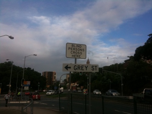
Who is this sign for?

(not the Grey Street one!)

Announcing Meld Studios (day 50)

I have been a bit tardy in making this announcement public (read too busy), but it is with great pleasure that I’d like to announce that I’ve teamed up with Steve Baty and Janna DeVylder to form Meld Studios.

I fully intended to start blogging about the experience of setting up a new company (a la Berg’s blog), but  as with previous best intentions, I won’t be placing bets on me actually doing this!

My summary of the first 50 days is as follows:

It is great to be part of a team

It is great to be working with other people. I have spent the past four years working as a freelancer/contractor. Although I’ve had some long-term gigs, it can be a lonely business. The ability to discuss things with people who have an equal vested interest in a successful outcome is wonderful.

I am also finding that the discipline of planning and strategising, that working with others forces upon you, is fascinating. So often we muddle through, but I’m finding myself question, challenge and think far more about decisions that previously I would have ducked.

You need to compartmentalise

Balancing the roles of owner, boss, practitioner, father and husband is tough. I feel I am cheating the edges at times.

Even the good times can be stressful

We are inundated with work (if you’re a potential client please don’t let this put you off!). We are finding we’re having to turn down projects that previously I’d have torn my right arm off for. The power of a team eh!

Where did all the hours go?

I can’t believe we’re 50 days into this. The time has just flown by. I am finding I’m working more hours, but I am really enjoying it. As Janna has said “we are so in start-up mode!”.

You need to take a step before I can tell you if you’re going in the right direction

In itself the involvement of users in the design process is no guarantee of a successful product or service. Reliance on users alone to guide you to the “right answer”, means you could be in for a long and winding design journey.

Designers must be prepared to develop and test paradigms. Failure to do this means you’ll yo-yo for an elongated period of time, and have little of any substance with which to get any meaningful user feedback.

I have been in a number of infuriating situations recently (generally design committee situations) where the team has shrunk from taking any responsibility for making a decision and instead asked to get the users help in making the decision.

Now don’t get me wrong, I am not saying don’t involve users. Nor am I saying make firm decisions before you involve users. But I am saying that if you are singularly incapable of making a step in any direction until you get confirmation from a user that you’re going in the right direction, you might consider a new profession!

You need to take a step before I can tell you if you’re going in the right direction!

Users guide and inform decisions, but it is the responsibility of the designer and/or business to actually make the decisions. Yes they can be tough, but with user involvement you’ll get their pretty quickly provided you are prepared to ask the tough questions and create materials that enable users to inform the decision. After all you are getting paid for it, the user isn’t.

</rant>