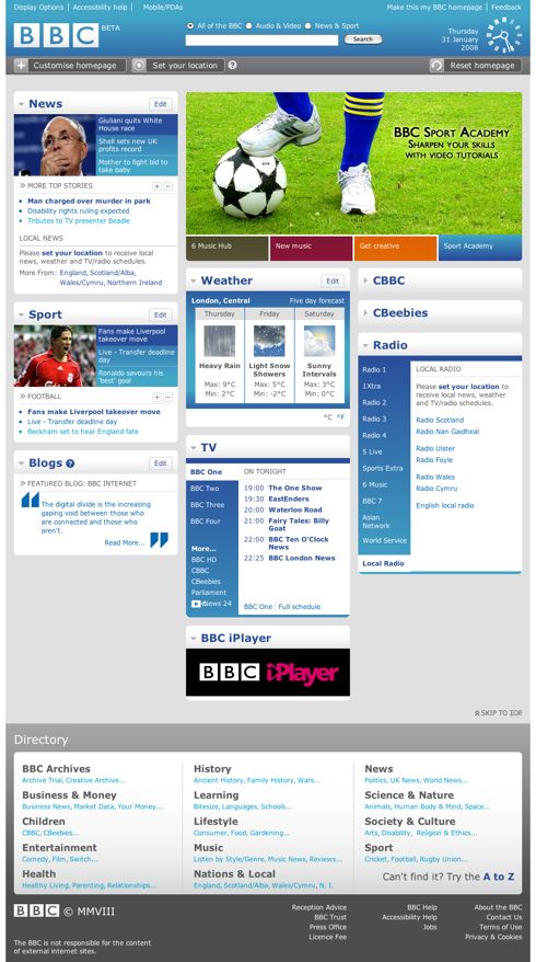
The concept of personalised homepages just doesn’t go away. Just about every media company/portal seems to have tried it once and the BBC is back for a second go with the the new BBC Beta homepage.
Despite all the hullabaloo, the first wave of personalised sites failed. The failure was partly that the technology didn’t quite live up to the CMS company hype and partly that people wouldn’t invest the time in personalising the site.
So will things be different this time? I think it is a question of how well the site can automagically learn what I like without me having to tell it. If it works in a brave Amazon recommendations type way, I think it could have something in it, but if the system sits their timidly only recommending things that match exact phrases I’ve already searched for, I think it is only a matter of time before it goes the way of My BBC.
Richard Titus, Acting Head of User Experience at the BBC, has blogged about the project (A lick of paint for the BBC Homepage). Well worth a read and a healthy set of passionate comments from the viewing public.
I have great faith in the BBC and the guile of their staff. If anyone can make personalisation really sing on a media site it is them.


it’s funny you should say that you have faith in the BBC to make personalisation work. I have the complete opposite feeling. I think the iPlayer (the download version) was so horrific in terms of usability, design, implementation etc etc etc. that it’s killed any optimism I once had. The real issue was that after throwing millions of pounds at the project, and many, many man-hours, the thing just didn’t work well.
I reminds me of my current job.
@Simon
Maybe my optimism is a little out-dated, I’ve been away from the UK for 4 years now so haven’t done any work with, or consumed the BBC in quite the same way as I used to for quite a while.
Being a non-UK resident I didn’t (and still haven’t had) the opportunity to use the iPlayer (growl) so have nothing to add to your comments there, except to say that it feels like it was probably a technology led product. In such cases it is often versions 2 or 3 where the usability starts to kick in.
As for your frustrations with huge, multi-million pound projects – I feel your pain brother. My experience is that larger projects have so many more ways in which they can fail or cause people to lose perspective on what they’re doing and why they’re doing it.
Hi just wanted to ramble about the BBC to a fellow pom in Oz (yes, despite the name ;-),
I see the BBC has now gone live with this – seems like they did take into consideration all the feedback and blog entries they found discussing their beta site – wonder how many people that involved 😉
Glad that they have gone for bigger font. Although it is customisable.
I also notice that the Search option is now just one box with no options, but once in the search results you can then search again within sections (sport, audio/video/web) This seems pretty neat.
During user testing we did recently on my work’s new web site, we noticed users didn’t change the default option to search what they wanted – which resulted in them not finding what they wanted. I presume this is the Google factor? and our fingers and brain being drawn to enter something quickly into a box and press return, before thinking about what we’re doing?
Also looks like it’s not a ‘smart’ home page – you pick your own ‘favourites’.
@Marie-Laure
I agree, keeping the search simple makes sense. When combined with the BBC’s methodical (or it was a while back) indexing of Best Bets, it means that you should never need to go scrurrying around the sections anyway.
This treatment of search results isn’t a new thing on the BBC’s site, they’ve been using this approach for 5 years or so.
I am not too impressed with the visual hierarchy afforded to the Search In area – kind of gets lost up there in the sea of blue.
Since writing the post and converting to the new BBC homepage, I am realising I don’t actually visit the BBC’s homepage that often. I generally by-pass it and go straight to the News or Sport sections. So don’t have too many tales to tell about interacting with it.
Agree with you about the ‘Search in’ area. Think the radio button format from the beta site was better. Search results display not up to much.
Also agree re the actual value of making the page customisable – I was playing around with it as an ‘exercise’ rather than doing it for use later.
But maybe the layout is more to do with being able to feed in automatically generated content and making it more flexible from the back-end for future developments along with a lick of paint to update the look.
Style over substance, cf the new washing machine control interface?